Why the layout matters
A football shirt does more than display a club’s colours. It arranges them into a shape that supporters can recognise from the stands, in a photograph or on a shirt worn years later. Move the same two colours from vertical bands to horizontal ones and the result can feel like an entirely different identity. Patterns also give designers a way to vary a kit without abandoning familiar colours.
The names are useful, but they are not strict rules. A shirt might have narrow stripes across most of its front, a single diagonal band over them, or a chevron formed by contrasting trim rather than a solid block. Sleeves, collars, sponsors and numbers can change how a pattern reads. The simplest way to identify one is to look at its dominant direction and shape.
Stripes: a vertical rhythm
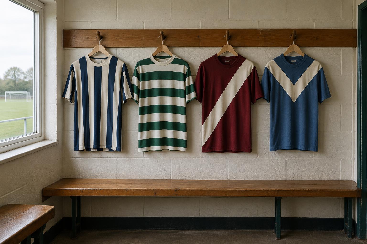
Stripes are bands that run mainly from shoulder to hem. They may be broad and evenly spaced, thin and closely packed, or unequal in width. A shirt with two large colour panels can resemble a striped shirt, but repeated vertical bands usually make the label clearer. Pinstripes are a subtler version: fine lines that may only stand out at close range.
Vertical stripes offer plenty of room for variation. A designer can change the starting colour at the centre, interrupt the bands for a number or sponsor, or continue them onto the sleeves. Those choices affect whether the shirt looks balanced. On a familiar striped kit, even a small shift in band width can be noticeable because supporters have learned its usual visual rhythm.
Hoops: bands across the body
Hoops run horizontally across the shirt. In everyday football language, the word often describes alternating bands on the front and back, whether or not every band continues unbroken around the sides. Broad hoops make a strong impression, while narrow ones can look almost like a textured surface from a distance.
The practical challenge is keeping the design legible where other elements sit. A large number placed over several bands needs enough contrast to be read; the same is true of a name on the back. A sponsor panel or a plain area can solve that problem, though it also interrupts the pattern. When comparing hooped shirts, look at how the bands align across the chest, sleeves and side seams. Those details can make a design feel continuous or deliberately pieced together.
Sashes: one diagonal statement
A sash is a prominent diagonal band crossing the torso, commonly from one shoulder towards the opposite hip. Unlike stripes or hoops, it does not depend on repeated bands. Its effect comes from a single strong line against a contrasting base colour. The band may have crisp edges, a border or a more understated tonal finish.
Direction matters because reversing a sash changes the composition, especially once a crest and sponsor are added. Its width matters too: a narrow diagonal reads as an accent, while a broad one can divide the front of the shirt into large fields of colour. Some designs repeat the sash on the back; others leave space there for names and numbers. Neither approach changes the basic idea of a diagonal focal point.
Chevrons: a point and a sense of movement
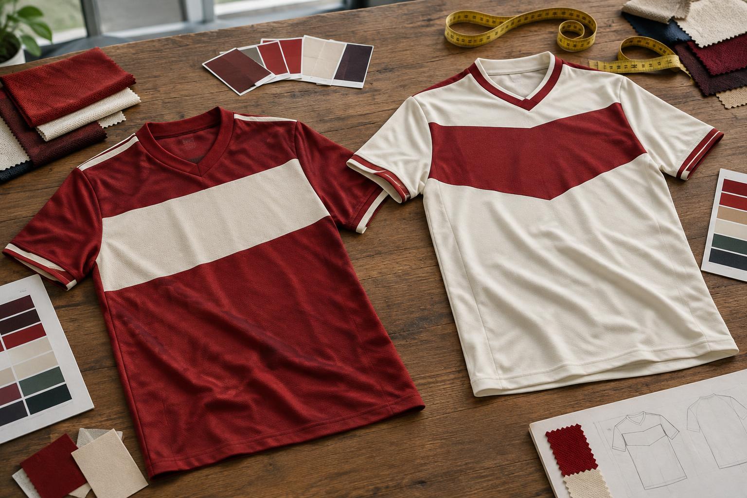
A chevron is a V-shaped element, often placed across the chest or near the shoulders. It may be a thick band, two angled lines or a shape built into the join between colour panels. Because its sides lead the eye towards a central point, a chevron can make an otherwise plain shirt feel directional and structured.
Not every V on a shirt is a chevron pattern. A V-neck collar is a garment detail; a chevron is part of the shirt’s wider graphic design. The distinction becomes clear when the angled lines extend well beyond the neckline. Like a sash, a chevron can be the main feature or a restrained accent. Changing its depth, thickness or position produces a noticeably different look without changing the shirt’s main colours.
Reading a shirt as a whole
Pattern names help describe a kit, but the full shirt determines how it works. Check the contrast between colours, whether the design carries onto the back, and how clearly the crest, numbers and other markings sit against it. A striking close-up detail may disappear at match-viewing distance, while a simple arrangement may remain instantly recognisable.
Shirts can also combine these ideas: stripes beneath a faint chevron, hoops crossed by a diagonal band, or tonal shapes visible only in certain light. In those cases, describe the most prominent feature first and the secondary detail second. That approach captures what makes the shirt distinctive without forcing it into a single category.