Start with the team, not the template
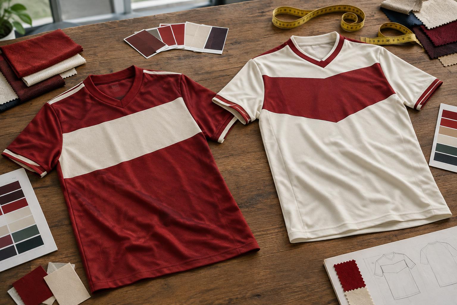
Before choosing a pattern, decide what the kit needs to say about the team. An established club may want to retain colors its players and supporters recognize. A new side might draw on a local landmark, a shared nickname or the colors of its home ground. Pick one or two ideas that people can explain simply; a design built around too many references can lose its identity at a distance.
Agree on practical limits early. Set a budget per player, decide whether the price must include shorts and socks, and find out how many extra shirts the team may need. Ask the supplier how long the design will remain available and whether single replacement shirts can be ordered later. Those questions matter when a player joins halfway through a season or a shirt needs replacing.
Choose colors that work during a match
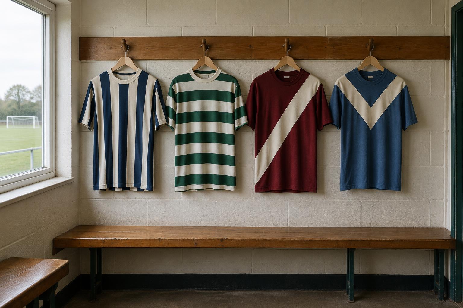
The main color should be easy to distinguish from an opponent’s kit, not just attractive in a close-up mock-up. Look at the design from across a pitch: can you tell the shirt from the shorts, read the number, and spot a teammate quickly? Strong contrast between the shirt and its lettering usually helps. Fine stripes, gradients and small details may look striking on screen but become hard to see in motion.
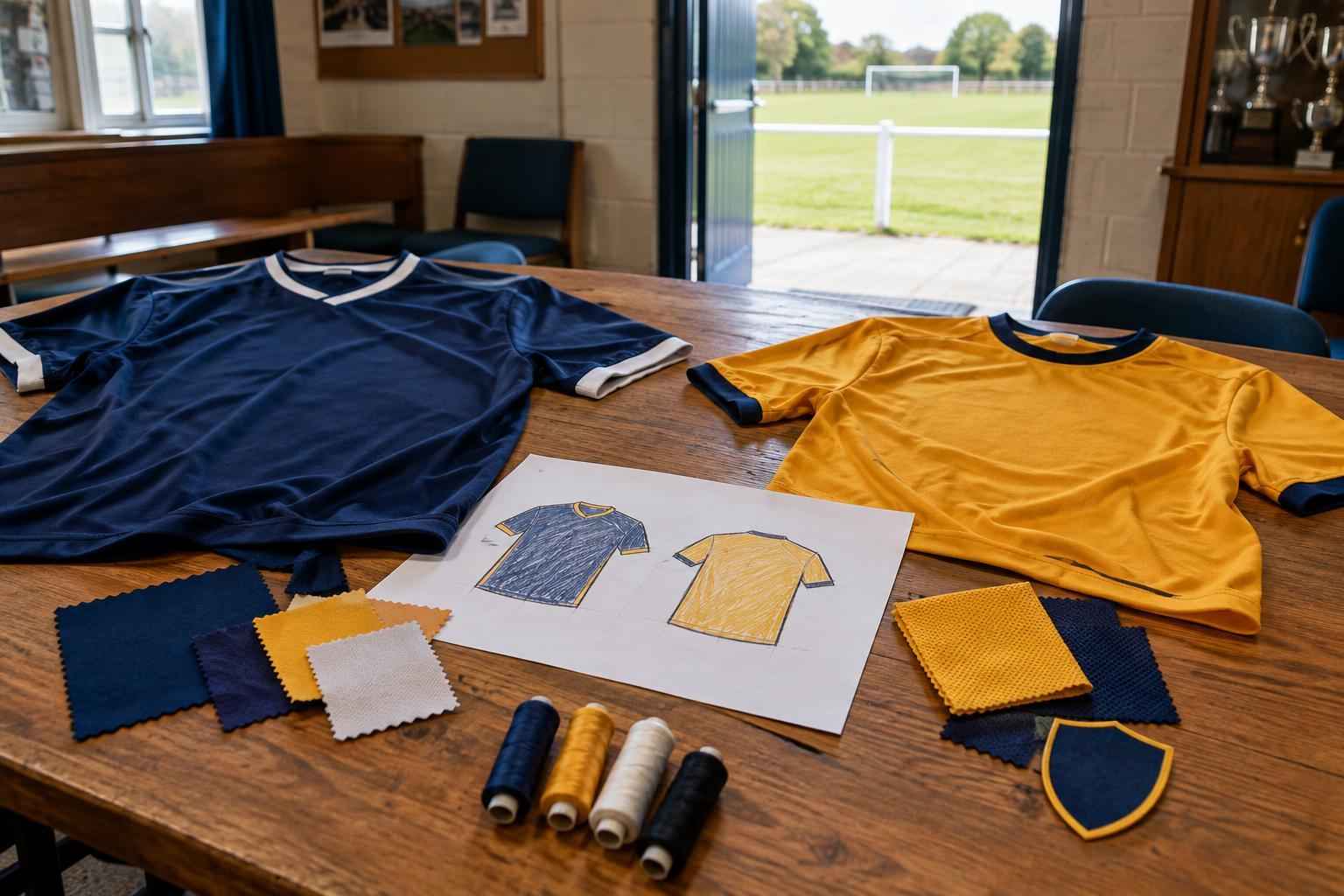
Consider the full set of shirts the team will need, including the goalkeeper’s. Depending on the competition, teams may also need an alternate color when their first kit clashes with an opponent’s. Check local competition rules before paying for production, especially if there are requirements for numbers, sponsors or color changes. An alternate kit does not need an entirely new visual identity; a clear color change with the same badge and type style can still feel like part of the club.
Give the badge and other marks room to breathe
The club badge is often the most meaningful part of the shirt. Place it where it remains visible without competing with a sponsor or a bold pattern. A common arrangement puts the badge on one side of the chest, a maker’s mark on the other and a sponsor across the center. It is a useful starting point, not a rule: what matters is that each element has enough space to be recognized.
Test the badge at its actual printed size. Thin lines, tiny lettering and subtle color changes can disappear on fabric, especially when printed over a busy background. If the crest is detailed, ask whether a simplified version will reproduce more clearly. Make sure the team has permission to use every logo supplied to the printer, including sponsor artwork. Put player names and numbers on a plain or low-detail area so they remain legible.
Match the decoration method to the design
Suppliers may offer heat-applied transfers, screen printing, embroidery or sublimation, in which the design is dyed into suitable fabric. Each serves a different purpose. Embroidery can give a badge a textured finish but may feel heavier and struggle with fine detail. Transfers allow names and numbers to be added individually, though their care requirements are worth checking. Sublimation can handle an all-over design without a raised print, but it depends on compatible fabric and production options.
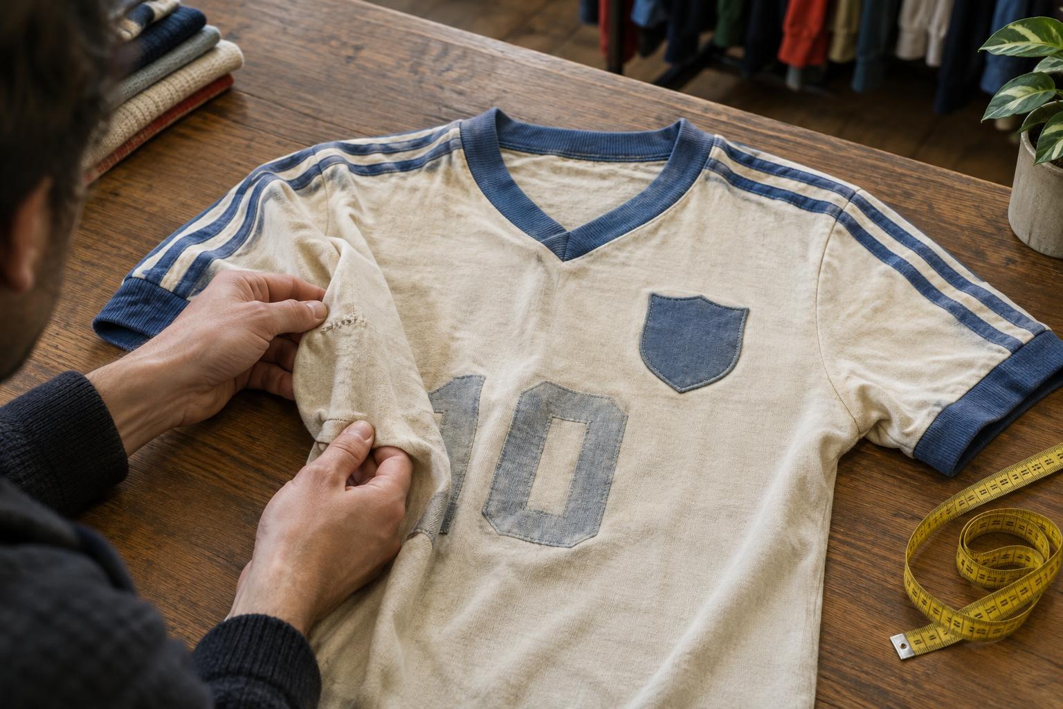
Ask for a sample of the proposed shirt and decoration if possible. Feel the fabric, stretch the printed area gently and check how the colors appear away from a screen. Get care instructions from the supplier and share them with players; washing and drying habits can affect both fabric and applied graphics. Compare the total cost of a finished kit, rather than the blank shirt price, because numbering, names and setup charges may change the choice.
Approve a kit the whole squad can wear
A design is only successful if players can move comfortably in it. Check the supplier’s size range, cut and measurement guide, and let players try a sample where possible. Consider how the shirt fits over a base layer and whether the shorts allow a full stride. If the squad uses a wide range of sizes, confirm that the design and badge placement remain consistent across them.
Before ordering, review one final proof showing the front, back, shorts and socks. Check spelling, number styles, logo positions and contrast at a realistic scale. Have one person collect corrections so the supplier receives a clear approval. The strongest amateur kit is not necessarily the most elaborate: it is recognizable, readable, comfortable and straightforward to replace when the squad changes.