A sponsor becomes part of the composition
A football shirt has to do several jobs at once. It identifies a team on the pitch, gives supporters something they want to wear and provides space for commercial partners. The main shirt sponsor often occupies the most prominent area: the centre of the chest. That position means its lettering, symbol and background can influence how the whole shirt is composed.
A narrow wordmark may sit comfortably across a plain panel, while a tall symbol or a logo with several lines of text needs more room. Designers might move a stripe, interrupt a pattern or leave a clear area so the sponsor remains legible. The effect is not always dramatic. On some kits, the sponsor fits the design so naturally that it seems like another graphic element. On others, the shirt appears to have been built around it.
Colour is a negotiation
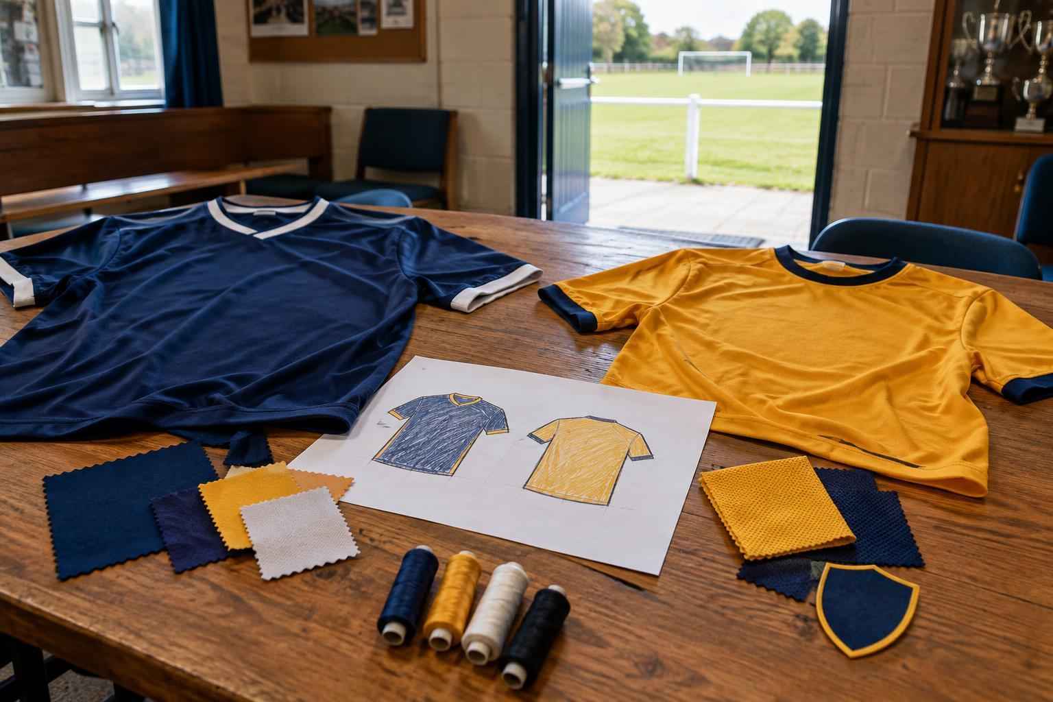
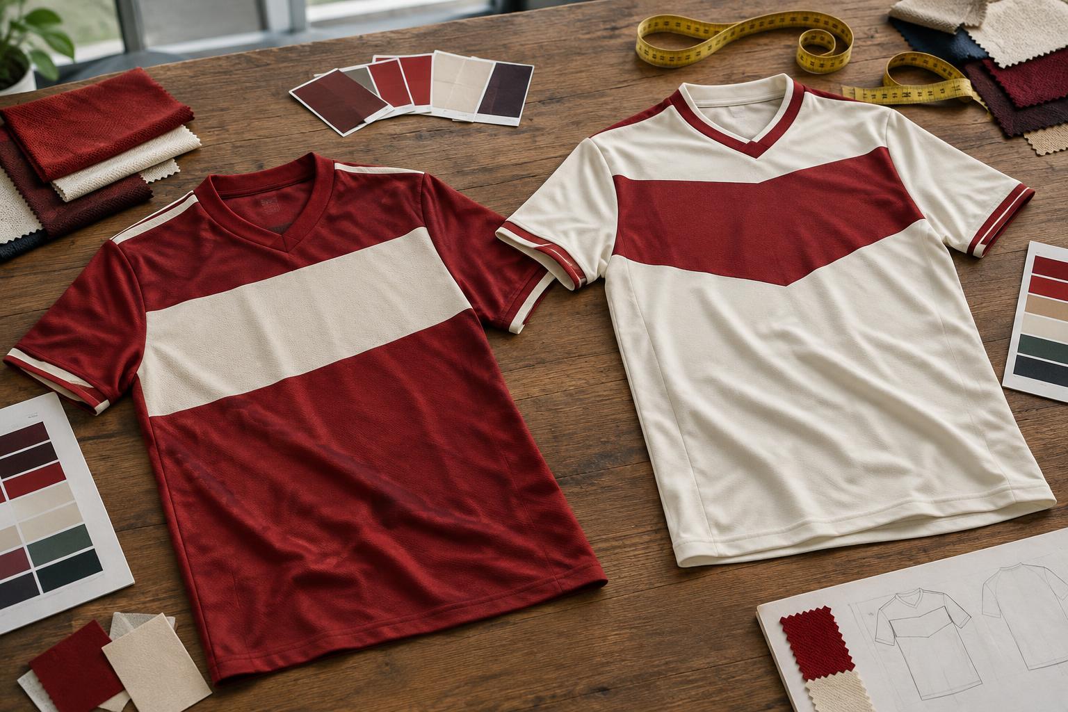
Club colours carry meaning, but a sponsor’s established colours may not match them. A bright logo can stand out against a traditional shirt; changing it to a single colour can make the overall design feel more cohesive. Neither approach is automatically better. Contrast helps a mark remain visible, while a quieter treatment can let the shirt’s stripes, sash or other familiar features take the lead.
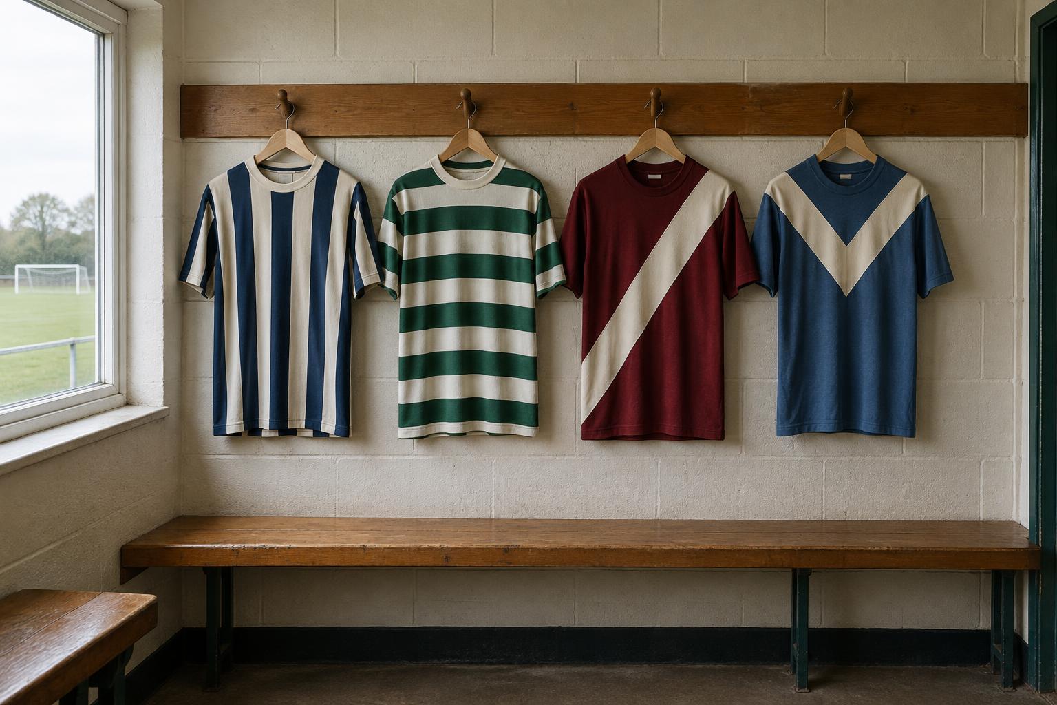
The background matters as much as the logo itself. Fine stripes or a busy print can make lettering difficult to read, especially when the shirt is seen from a distance. A plain chest panel is one solution, though it can divide opinion if it breaks a pattern supporters associate with the club. Designers may instead adjust the scale of the print or use an outline around the sponsor. The final choice reflects a compromise between appearance, recognition and the sponsor’s desire to be noticed.
Why size and placement change the feel of a kit
Two shirts can use the same colours and still feel very different because of the sponsor’s proportions. A large mark creates a strong focal point; a compact one leaves more visual space for the club crest, manufacturer mark and fabric design. Spacing between those elements matters too. If they compete for attention, the front of the shirt can feel crowded even when each element looks reasonable on its own.
The design also has to work beyond a close-up photograph. Players move, shirts crease and a viewer may see the kit from across a pitch. Supporters encounter it in other ways: on a shop rail, beneath an open jacket or in an old team photograph. These different views help explain why a simple, clearly placed sponsor can have more impact on a kit’s character than a complicated pattern elsewhere on the fabric.
Sponsors can become part of a shirt’s memory
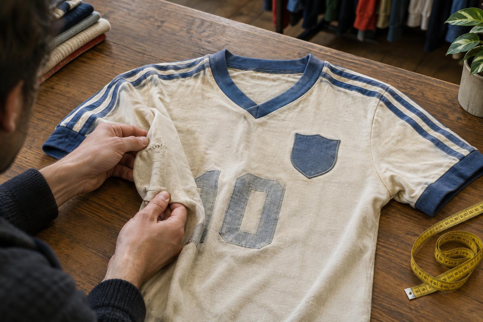
A sponsor is a commercial addition, but repeated exposure can give it an unexpected place in football culture. Supporters may associate a particular logo with the shirts worn by a familiar group of players or with their own first kit. Years later, the sponsor can help identify an era as quickly as the collar shape or crest style. That association does not mean everyone liked the design when it appeared; nostalgia can change how a shirt is viewed.
This is why a change of sponsor can make even a conservative new kit look unfamiliar. The underlying colours may stay the same, yet a different typeface or logo shape alters the balance of the front. Conversely, a long-running sponsor can make varied designs feel connected. Its visual consistency becomes part of what supporters expect to see, even though it is separate from the club’s permanent symbols.
Reading a kit as a set of choices
When looking at a shirt, start with the spaces around the sponsor rather than the logo alone. Has a stripe been stopped at the chest? Is there a solid panel behind the lettering? Does the logo echo a colour elsewhere, or is it deliberately the boldest element? Those details reveal how the designer has tried to bring different interests together.
The strongest solutions tend to give both the club and sponsor room to be recognised. There is no single formula: a bold logo can suit a minimal shirt, while a restrained one may help a detailed design breathe. Understanding that balance makes kit design more interesting. What looks like a simple football top is often a careful arrangement of identity, visibility and the small visual decisions that make a shirt memorable.