A shirt has to work at a distance
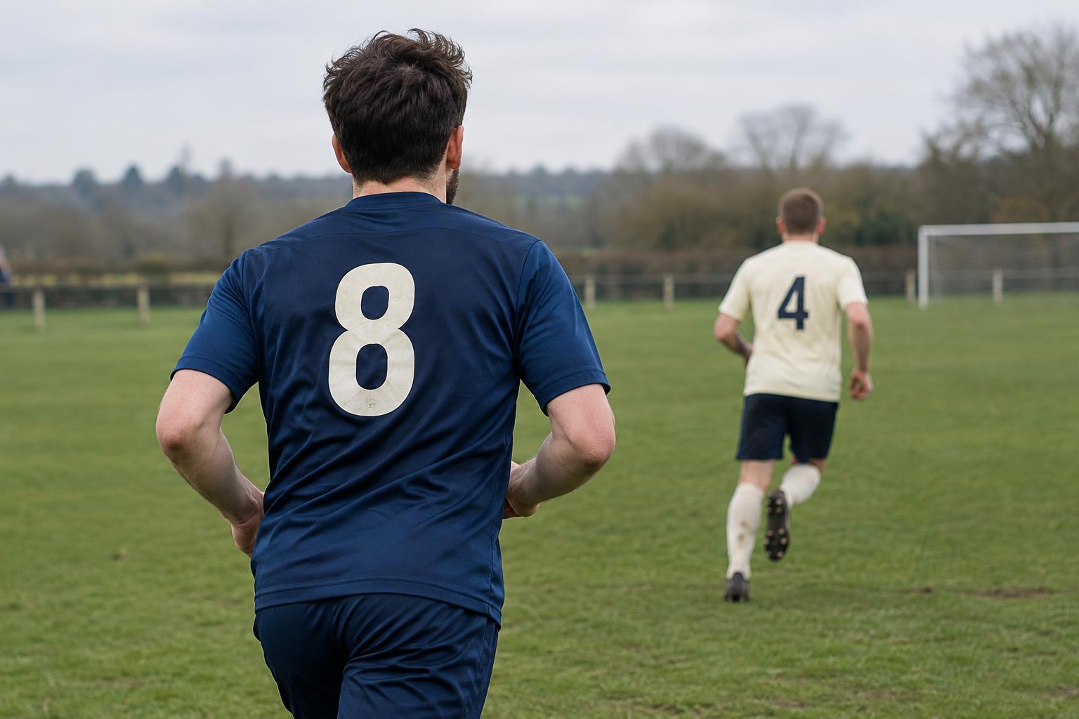
A football shirt is seen in motion, from the stands, across a pitch and through a camera that may be following the ball rather than the player. Its number must remain recognisable in all those situations. A player name has a different job: it adds identification and personality, but it is usually read from closer range or during a pause in play. Good shirt design respects that difference instead of treating the back of the kit as one flat graphic.
The number is typically the strongest element on the back. It needs a clear outline, enough size to be distinguished from nearby players, and a position that does not disappear into folds when the wearer runs. The name should be legible without competing so heavily that the two elements merge. Supporters may notice a typeface first, but its real test is whether they can read it when the player turns, stretches or moves into shade.
Contrast comes before colour preference
The key question is not simply whether a number is dark or light. It is whether the number stands apart from the part of the shirt behind it. White lettering can be crisp on a deep, uninterrupted colour but harder to pick out over a pale stripe. A dark number can have the opposite problem. Patterns, gradients and sponsor graphics create further distractions, particularly where they cross the back panel.
Designers can improve separation with a contrasting outline, a solid backing area or a quieter section of the shirt. An outline needs enough weight to stay visible when viewed from afar; a hairline border may look precise up close yet vanish on the pitch. Strong contrast also helps when lighting varies or a broadcast image loses fine detail. Competition rules may set requirements for numbering and names, so a visually appealing idea still has to be checked against the rules that apply to that kit.
Letter shapes determine how quickly a name reads
Type choice affects recognition as much as colour. Distinctive letterforms can give a kit character, but flourishes that make several characters look alike slow a reader down. Clear internal spaces in letters such as B, P and R, and recognisable shapes for characters that can be confused, matter when names appear small in a photograph. The same principle applies to digits: a 1 should not be mistaken for a 7, and a 3 should remain different from an 8.
Spacing is a balancing act. Letters packed tightly together can blur into a single shape, while letters spread too far apart can make a name feel disconnected. Longer names may need narrower characters or adjusted spacing to fit the available width. Reducing the letters until they fit is not always the best answer; a consistent, readable approach across the squad gives the kit a stronger visual system than a series of individual compromises.
Placement has to account for a moving body
The back of a shirt is not a rigid sign. Fabric bends over shoulder blades, bunches at the waist and stretches as a player moves. A name set too high can curve around the shoulders; a number placed too low can be obscured when the shirt folds. Designers therefore work within the usable area of the back, leaving enough space between the name and number for each to read on its own.
The overall kit matters too. On a striped or patterned shirt, the front and back may need different visual treatments. Sleeve details, seams and garment construction can affect where marks sit and how cleanly they can be applied. Before settling on a layout, it is useful to view a sample on a person rather than only on a flat template. A quick look from across a training ground can reveal problems that a close-up mock-up hides.
Identity and clarity can share the same shirt
Numbers and names are part of football style: their typefaces, colours and placement can help make a kit feel unmistakably connected to a club. That identity does not require sacrificing readability. A distinctive typeface can keep its character through broad shapes and carefully chosen details, while the essential contours of each digit remain simple. Decorative effects work best when they support the main form rather than breaking it up.
The most useful design check is to test the shirt in the conditions in which it will be worn and seen. Look at single- and double-digit numbers, short and long names, players standing and moving, and views from near and far. If identification remains easy without someone having to study the shirt, the design has done more than decorate the fabric. It has made a familiar part of the game work.